Composition, something that I probably do not think about
enough especially when it comes to visual design therefore I think its wise I start
thinking about it more often when drawing and digital painting as it is
something that can make or break the overall look and feel of a piece of work
but when used well it can improve a piece or sketch and add to its visual
appeal. Composition is all about using certain ways of arranging elements in an
image to make the overall layout and look aesthetically pleasing and also can
be used to draw the viewer’s eye to certain areas of the image more than
others.
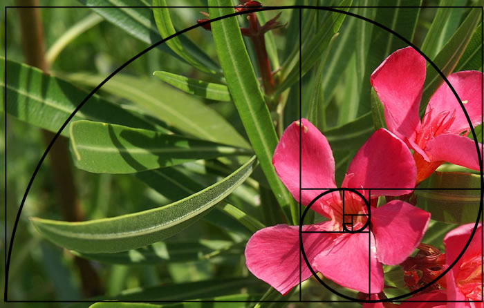
this is an example of one rules in composition called the golden ratio, in simple terms you can see the two boxes at the centre of the spiral, basically they are doubled each time, the result when each corner of the squares are drawn to create a spiral which is the way the eye moves around the image therefore you would usually put the focal point of the image at the centre of the spiral.
Line, Shape, Colour, Texture, Form, Value and Space.
if you were to elaborate on the forst list it would include Shape and roportion,Positioning/Orientation/Balance/Harmony, Negative space, Colour, Contrast, Geometry, golden ratio spiral, Lines, Rhythm, Lighting, Repetition, Perspective
when using different styles of drawing and media not all the aspects may needed to thought about such as when doing quick sketches with a fineliner for example colour will not need to thought about however contrast and tonal value may be. something like perspective though is always noticeable not matter what you drawing and is probably one of the most important things when drawing as wrong persective can really ruin the feel of an image.
| Bad Pespective. |
 |
| Good Perspective |


whilst looking for some examples of bad composition i came across i good basic look at compositon on another blog with some basic but very helpful info.
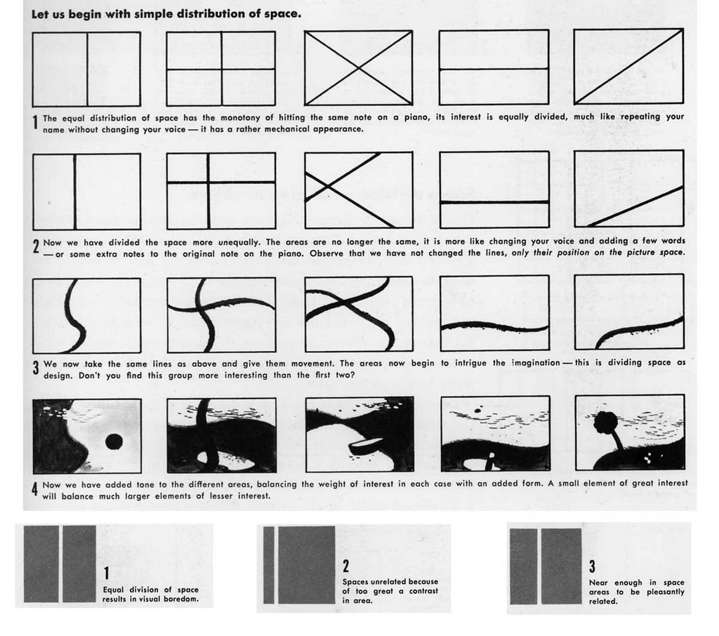
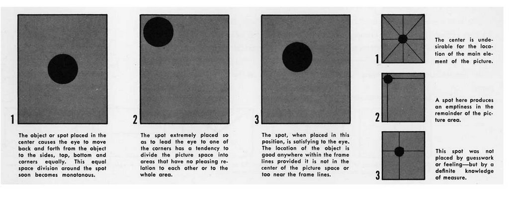

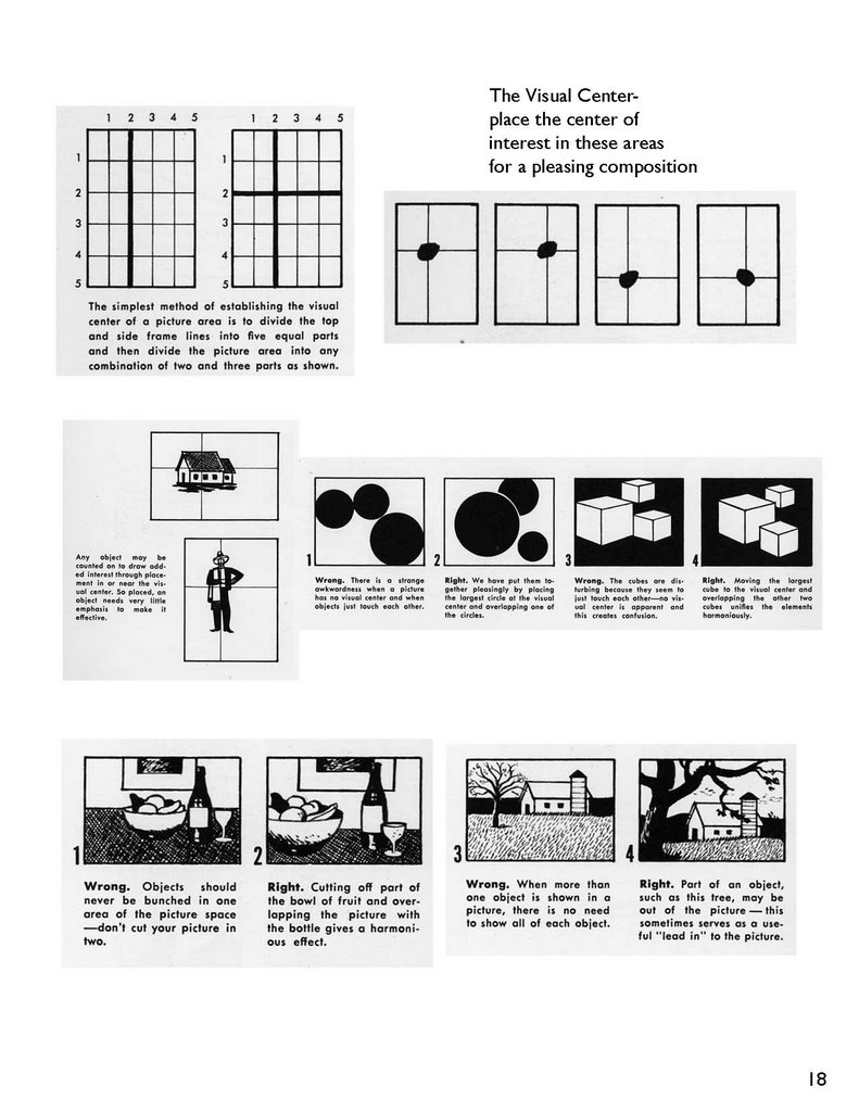
beginners guide to digital painting-book

No comments:
Post a Comment